

Instagram Feed Layout Ideas

Have you ever scrolled through a brand’s Instagram account, and their feed looks so professional it makes you stop and say, “Whoa!”? If so, there’s a good chance that they’re using an Instagram feed layout. A layout is a great method of organizing your photos and other visual content into a framework to make your feed look truly polished and put together.
In today’s post, we’re going to talk about the important parts of your brand’s aesthetic, as well as look at 6 Instagram feed layout ideas you can start using today. Click “play” on the video below, or keep reading to see my personal favorites and how to create each one.
First, let’s talk brand aesthetic. When it comes to Instagram, there is ONE must-have aesthetic that every single brand should have, which is your color theme. In the examples I’m sharing with you today, you’ll notice one thing they share in common is that they each have a strong color theme. If you want my tips and ideas on how to pick the right color theme for your brand, you can check out this post: “How to Choose Your Brand Colors”
Once you have your color theme, you could choose to stop there and your feed would already look cohesive. And, there’s nothing wrong with stopping there. But, I’m assuming you’re here because you want to take it a bit further and find a layout that works for your brand. As we look at the examples I’ve created, try to imagine them with your own brand’s colors and style of graphics or photography. If you’d like easy access to all of this information, including which apps to use and the directions to follow for each of these themes, sign up in the box below for a free PDF download that shares all of the information in a printable format.
Instagram Layout idea 1:checkerboard

To create this look, you’ll need to choose two distinct post styles that align with your brand’s aesthetic. Once you have your two distinct styles, every other post should be in each of the styles. In the example below, the pattern goes: photo, quote, photo, quote, photo (and so on).
However, if you don’t have quotes to use, don’t worry! You could also just use two distinct photography styles, or even two distinct graphic styles. Apps like Unum and Planoly can help you arrange your posts in a checkerboard fashion before you post them.
Instagram Layout idea 2: collage
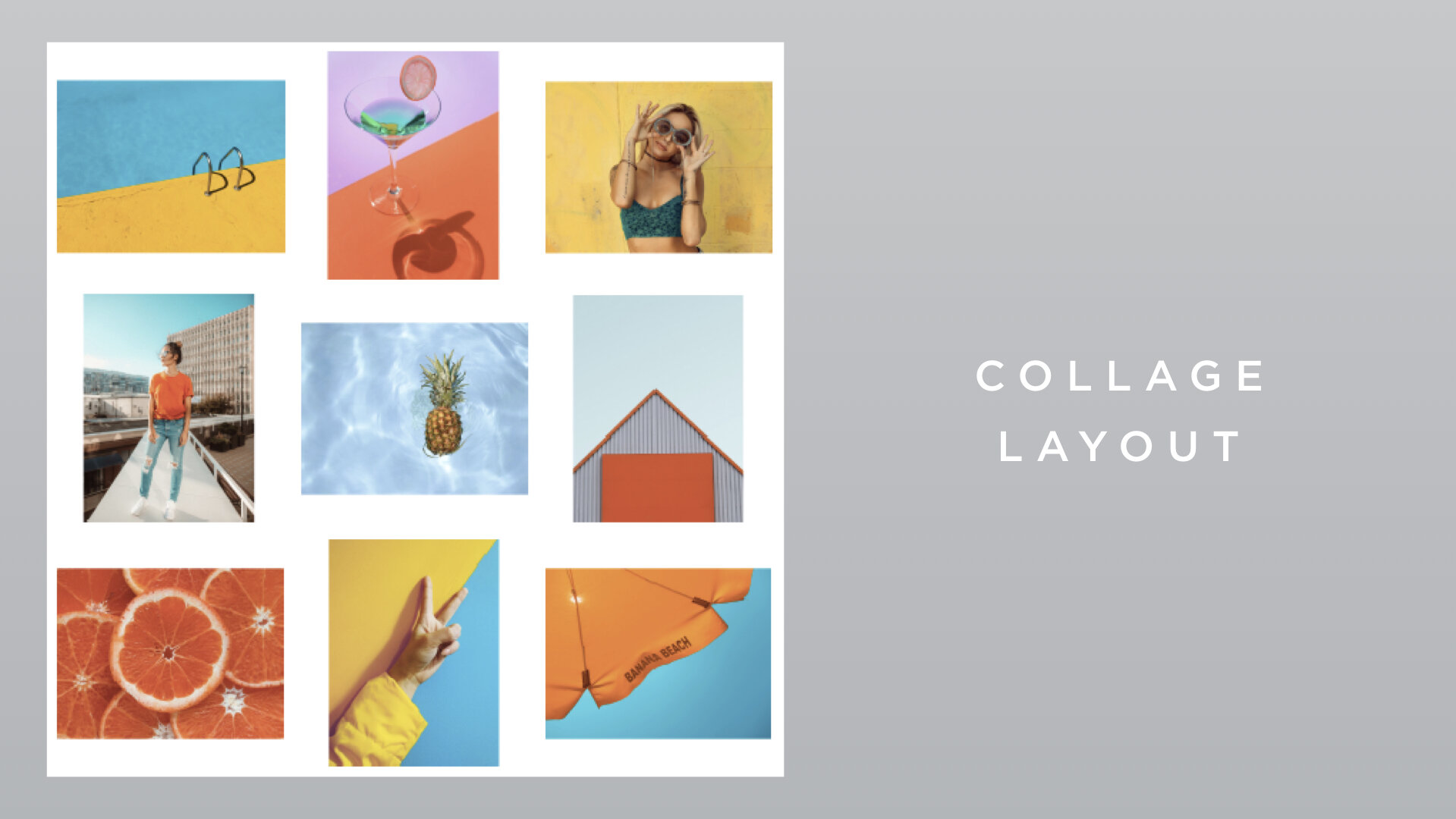
To create this look, you'll need two distinct border styles: one that crops your photos horizontally with a white background like this:
(note: if you’re having a hard time seeing the border on the next two images, drag and drop the image to your desktop, or save it to your phone’s camera roll to see the white background more clearly)

and one that crops your photos vertically with a white background like this.

It's really important to keep the 2 border styles each consistently the same size. Because of this, I like using Canva's free online design software to set up each of these as templates. Canva makes it really easy to design, save and use custom templates. Once you set up and use your templates, download the finished photos from Canva and use apps like Unum or Planoly to arrange your photos in a pattern of horizontal, vertical, horizontal, vertical (and so on) prior to posting.
Instagram Layout ideas 3 and 4: horizontal & vertical lines
You might want to play with a feed that has horizontal lines or vertical lines. To do either of these layouts, you'll need at least 2 distinct post styles, (but of course you could do more). You’ll also need to use a feed planning app like Unum or Planoly, so you can drop your photos in, then rearrange them to create a style with either vertical lines or horizontal lines. It seems complicated, but it’s really very simple to do!


Right now on my instagram feed, I’m playing around with the horizontal lines aesthetic combined with a rotating color theme. It’s a little more complicated than just doing horizontal lines, but I wanted to give it a try. If you want to check out the latest on my feed, click here. if you come over to instagram from here, I’d love to for you to say hi and let me know you came from this post!
Instagram Layout idea 5: Shape
The 5th idea I want to share with you is the border layout. This gives your feed a really clean cut look. To do this, you'll need to select a border style and color that aligns with your brand's aesthetic. Then, you'll need to find an app like Instasize, PicFrame or Lighto that can help you add your desired border before posting. As I said before, it’s really important that you use a consistent border color and size to make this theme look as professional as possible.

Even though this isn’t what I do on my feed, this is actually one of my favorite layouts!
Instagram Layout idea 6: Shape
This is a unique layout, and (when properly done) can really make your brand’s feed pop. To make a shape in your feed, start by thinking of your brand’s aesthetic. You’ll want to pick a shape that aligns with it to create this super memorable feed. The feed in the example is basketball themed, so it’s only fitting that the shape picked here is a circle, like a basketball.
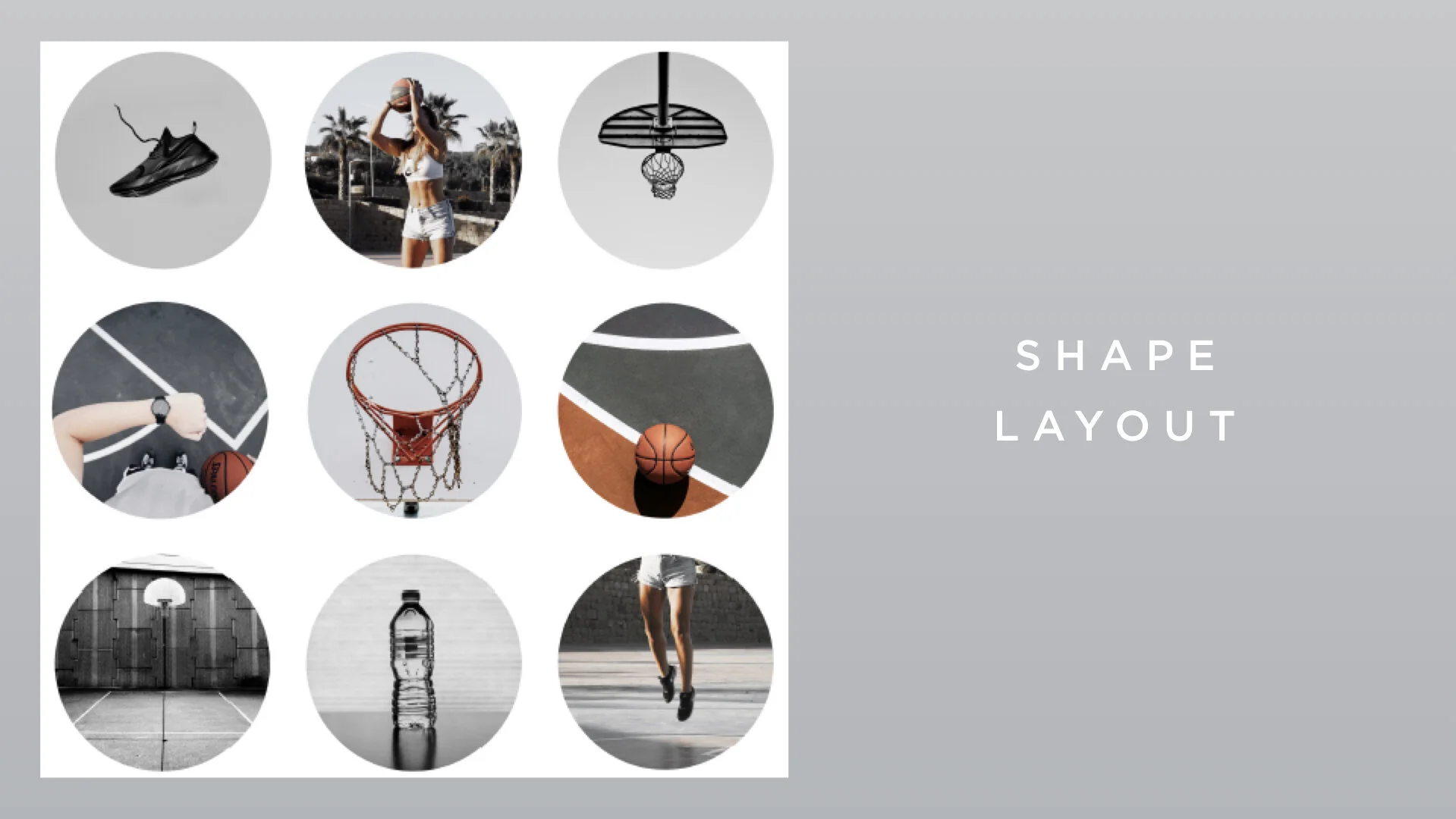
Once you’ve picked a shape that aligns with your brand, use one of the apps like Lighto or Picsart, that will help you cut your photo into your desired shape before posting. I typically recommend keeping a white background for this Instagram theme. But, if you have an on-brand reason to do otherwise, go for it!
So remember: The most important part of your brand’s aesthetic is having a solid color theme. There are tons of different options of layouts that you can use, just be sure to represent your aesthetic, and use the apps I shared with you to help make it super simple to create your feed!
Have a favorite layout, or one I haven’t addressed here? Leave a comment below and tell me all about it!